
Brand kit + product kit
Growth,
Unlocked
Surfside is the infrastructure that brings data, performance, and monetization to retailers, enabling brands to activate where the majority of purchases actually happen.
Essence
Growth Unlocked
Promise
Get More From Every Customer Interaction
Voice
Trusted, Candid, Empowering
Proportion
80 neutral / 20 accent
What's inside
Two kits, one token set
The brand kit carries the written brand, the visual foundations, and the assets for marketing surfaces. The product kit is the React component library for interfaces. Where they overlap, the values are identical by construction.
:root custom propertiesfonts.css@theme — the token source of truthVerbal · Positioning
The sentence the system builds from
Surfside is the Advertising Operating System that brings data, media, and measurement to independent retailers, enabling a more effective way for brands to drive real sales.
Surfside operates at the intersection of two distinct customer groups. Independent retailers need tools that translate customer data into revenue without an enterprise-level team to run them. Advertisers need access to purchase moments that happen outside the walled gardens they have been working within.
Why
Independent retailers need modern infrastructure to stay competitive, and advertisers need to reach shoppers where commerce is actually happening.
How
Surfside connects independent retailers into a shared system that improves onsite performance, deepens customer understanding, and unlocks new revenue.
What
The Advertising Operating System that brings data, media, and measurement to independent retailers.
Hierarchy of meaning
Growth Unlocked
Get More From Every Customer Interaction
The essence is the spark. The promise translates it into a commitment the audience can hold the brand to. The pillars break the commitment into the five things the platform delivers. The further a concept drifts from the essence, the less it sounds like Surfside.
The five pillars
- 01Connect independent retailers into one system
- 02Improve performance from day one
- 03Help retailers understand and monetize their customers
- 04Give brands access to real purchase moments
- 05Measure impact against actual sales
Verbal · Audiences
Two core audiences, one network
The symbol, the super headline, and the messaging all encode the same structure: two distinct presences that only work as a system.
Independent, multi-brand retailers with e-commerce
They need tools that translate customer data into revenue without requiring an enterprise-level team to run them.
Voice in the super headline · OT Jubilee Silver
National and challenger brands driving measurable growth
They need access to purchase moments that happen outside the walled gardens they have been working within.
Voice in the super headline · OT Jubilee Sapphire
Verbal · Messaging
Key messages, ready to run
Segmented by audience, plus a blended pair that speaks to both sides. The copy can shift with the format; the core claim stays fixed.
Blended
A Shared System for Super-Powered Outcomes
Our infrastructure is united by design. We plug retailers into one, ever-growing system, so retailers and advertisers can harness scaled reach and sales power.
Real Transactions, Real Impact
Measure performance against actual transactions, not disconnected data points. Increase impact across every order by tracking the real thing.
Advertisers
Better Performance Starts at the Sale
We help brands clarify what converts based on real sales data. Measure what's definitely working, right from the source.
Monetize What You've Been Missing
Unlock real purchase moments. No more misplaced messages or wasted spend. Just an all-access pass to shoppers ready to buy, where products are actually available.
Retailers
We Drive, But You're in Control
We're built to empower, not take control. You stay in charge of your customer relationships and data, while we drive stronger onsite performance and conversion.
Monetize What You've Been Missing
Misunderstanding equals missed opportunities. We help retailers decode customer behavior so they can turn existing traffic into new revenue.
Emotional · how it feels
- 01Equipped to compete with larger platforms
- 02No longer left behind by outdated infrastructure
- 03In control of customer relationships and data
- 04Confident in performance, revenue, and growth
- 05Part of a more modern retail ecosystem
Functional · what customers receive
- 01Better onsite performance from day one
- 02Stronger customer understanding and smarter personalization
- 03New revenue from existing traffic and brand partnerships
- 04Higher margins and more value from each order
- 05More effective advertiser activation where purchases actually happen
Technical · how it works
- 01Connects retailers into one system — integrates across ecommerce, POS, and CMS platforms with one-to-many onboarding.
- 02Improves performance from day one — drives onsite conversion through personalization and real-time product data.
- 03Monetizes customer understanding — turns transaction and behavior data into new revenue through brand participation.
- 04Gives brands real purchase moments — activates where products are available and shoppers are ready to buy.
- 05Measures against actual sales — closed-loop attribution tied directly to transaction data.
Verbal · Voice
Simplifiers, Maximizers
We use deep industry knowledge to simplify complex systems and ideas. Where others exclude and overcomplicate, we provide access and lead with clarity. The tone this creates isn't bravado. It's the quiet authority of a platform that already works.
Trusted
Confident and credible. Knowledgeable partners who reassure customers who feel overwhelmed and outmatched, putting them in capable, performance-driven hands.
It earns its claims. It shows the work.
Candid
Plain and direct, like an informed, human friend. We cut through complexity and jargon to show exactly how we're unlocking value in a market that's kept it out of reach.
No ecosystem-speak. No hedging.
Empowering
A force multiplier. We equip retailers and advertisers with the tools, timing, and ownership once monopolized by industry giants.
It writes to capability, not around it.
All three properties belong in everything from hero lines to product tooltips. Retailers are sophisticated operators. Brand teams know their attribution problems. The copy treats them accordingly.
Verbal · Copy frames
Lines that are already written
Taglines and campaign frames drawn from the guidelines and the brand showcase. Reach for the essence and promise in brand-level moments; the two-word lines carry campaigns and heroes.
Campaign · social
Access,
Granted
The all-access pass to purchase moments the walled gardens kept out of reach. Companion line: “Unlock real purchase moments.”
Campaign · social
Value,
Realized
The payoff of measuring against actual sales rather than disconnected data points. The canonical super-headline example.
Website hero
Be Where the Buying Happens
We bring brands and retailers together using real sales data from thousands of stores most retail media can't reach. The result: high-intent audiences, unique inventory, and campaigns measured against actual sales.
Website subhead · AdvertisingOS™️
Powered by Retailers. Activated by Brands. Measured by Sales.
Surfside is the operating system for advertising and retail media. One platform connects brands, retailers, and shoppers across every channel, with every campaign tied to real sales.
Supporting frames
- The blind spot in retail media
- For the retail majority
- More stores. More shoppers. More results.
- Advertising and retail media in one place.
- Spend smarter, and get more from your stores.
- Built to Compete
- Monetize What You've Been Missing
Naming: AdvertisingOS™️ keeps its mark as written. Surfside Solutions, Inc. is the legal entity and appears only in copyright and legal contexts. The brand name everywhere else is Surfside.
Visual · Brandmark
A symbol and a wordmark, read as one
The symbol is an abstract S letterform that mirrors the curves inside the wordmark, and holds the cross-section between the two core audiences. The wordmark is bold all-caps display, drawn from the Madman-era of advertising: brands speaking with confidence and taking up space.


Off white on soft black
Neutral white on soft black
Soft black on off white


Symbol · 3.2


Wordmark · 3.4
Wordmark clearance · 1× its height
Symbol clearance · 0.5× its height
Use the lockup by default. Separate the symbol or the wordmark only where space or context calls for it, and only once familiarity with the brand is established.
The mark is approved in three colors: off white, neutral white, and soft black. The three colorways share identical geometry.
Incorrect usage · 3.6
- Obscure or distort the logo
- Manually typeset the logo in any font
- Rotate the logo
- Use colors outside the three approved
- Change the spacing of the logo
- Replace the tittle with an unapproved symbol
- Place the logo on an illegible background color
- Place the logo on an obscuring area of an image
Visual · Typography
Three typefaces working as one
Two display faces for expressive, large-scale moments, and one workhorse for everything else. Every specimen below is set in the licensed cuts the kit ships.
Growth Unlocked
The primary display sans. It carries the most personality in the system and is reserved for headlines at large scale. Not for body copy.
Value, Realized
The serif counterpart, designed to be used alongside Silver in headline pairings. Silver carries the structural weight; Sapphire introduces personality and warmth.
Get More From Every Customer Interaction
Everything from eyebrows and labels to body copy and extended text — any application that requires sustained readability.
Base type system · 4.4
- AaHeadlines — Jubilee Silver Extrabold · −2% tracking · 100% leading · Title Case
- AaSubheads — Jubilee Silver Medium · 0% · 110% · Sentence case
- AaBody copy — ABC Arizona Regular · 0% · 115–130% · Sentence case
- AaCaptions — ABC Arizona Bold · 10% · 100% · All Caps
Captions and eyebrows are two distinct roles sharing one face. Captions run 14px at 10% tracking; eyebrows and CTA labels run 16px at 3%. Never blend the two settings.
Size ramp
Display
Aa
140 / 100% · hero only
H1
Aa
62 / 103% · section headlines
H2
Aa
29 / 105%
Subhead
Aa
28 / 110%
P1
Aa
20 · lead body
P2
Aa
16 · body
Eyebrow
Aa
16 / 140% · 3% · caps
Caption
Aa
14 / 100% · 10% · caps
Display is a super-headline size, not the default headline. Ordinary section headlines use H1. P1 and P2 carry the tight single-line leading; multi-line copy uses the 115–130% range.
The super headline · 4.5
Access,
Granted
Both faces set identically — same size, same weight (Medium), same tracking (−2%), same leading (90–100%), same baseline. The contrast comes from the letterforms alone.
One voice per phrase. The face switches at a word or phrase boundary, never mid-word. Silver leads as the retailer's voice; Sapphire answers as the advertiser's, carrying the closing phrase.
Seven words or fewer, best at five. All typography is set in the brand neutrals, never in secondary colors — confirm the 5.5 pairing before setting type on any background.
Visual · Color
Neutrals carry it, accents point at things
Five neutrals make up roughly 80% of any composition: backgrounds, type, negative space, primary layout. Teal, neon, purple, and green make up the other 20% in buttons, icons, small tags, and data labels. They are never backgrounds and never primary expressive surfaces.
Neutrals · 5.1 · each swatch shows its approved type color from 5.5
Soft Black
#1B1B1B · 27 27 27
Dark Gray
#9A9A92 · 154 154 146
Light Gray
#E2E2D9 · 226 226 217
Neutral White
#FAFAF9 · 250 250 249
Off White
#EFEFEA · 239 239 234
Accents · 5.1
Purple
#7A22FF
Teal
#5EDABB
Green
#B4E8A7
Neon
#DFFF3C
Dark Purple
#5417AF
Dark Teal
#189D7B
Dark Green
#7FA475
Dark Neon
#9AAA4A
Light Purple
#C198FF
Light Teal
#ABF9E6
Light Green
#DBFCD2
Light Neon
#F1FFA9
Functional colors · 5.2 · charts, data visualization, system status
Not approved for branded or marketing applications. They do not appear in ads, one-sheets, website heroes, or any context where a viewer would read them as brand colors.
The logo is approved in off white, neutral white, and soft black only. Never in a secondary color, a functional color, or any tint or shade outside those three.
Visual · Art direction
Photography carries the visual language
Icons and graphics support the art direction; they don't replace it. Three photography families and three S-form frames, each shape paired to the content it holds.

Retailer portraits · 6.1 · leaf frame
Warm, human, specific. Store owners in the world of the bodega, the specialty shop, and the neighborhood grocery. The brand's most direct expression of its underdog sensibility.

Consumer portraits · 6.2 · corner-cut frame
Warm and tonal, soft in light, calibrated closer to consumer brand photography than enterprise SaaS. It keeps the human layer visible in technical product contexts.
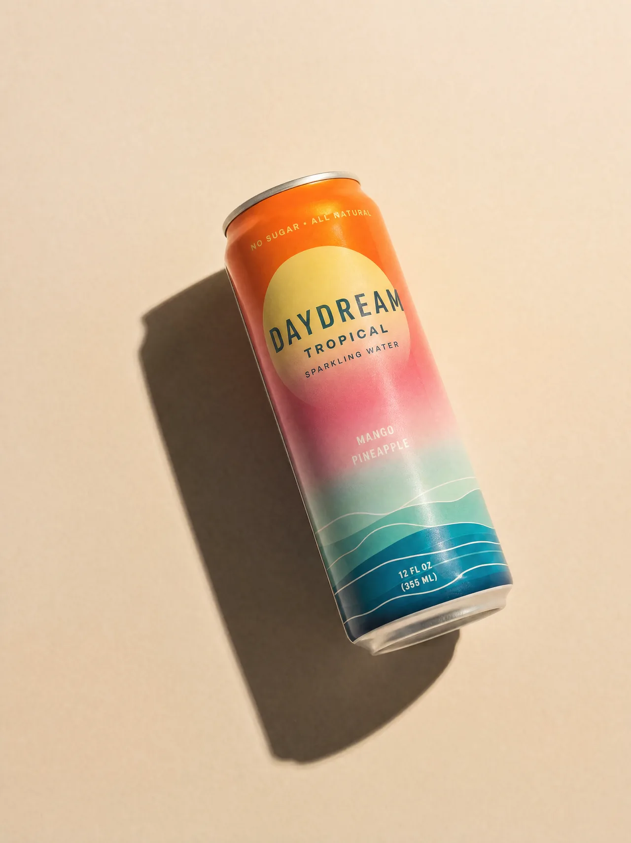
Product photography · 6.3 · arch frame
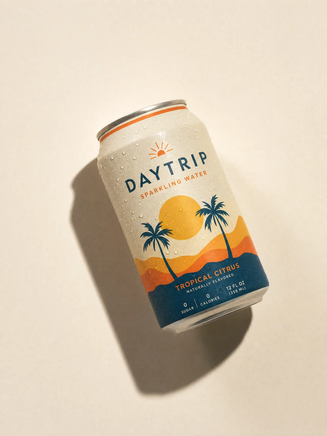
Generative overhead shots on a consistent house style: cream backgrounds, warm light, crisp shadows. Fictional brands illustrate retail context without legal exposure.

The glass treatment · 6.5
The frame becomes the glass. The interior becomes the store.
The photo sits in a rounded card at 30px radius. The frame shape masks the sharp, full-color image, and the area of the card outside the shape shows the same image frosted — blurred and tinted toward off white. The glass is not a border; it is the blurred surround that makes the frame read as a storefront window.
The effect uses off white only, and belongs to the retailer-portrait context. It does not migrate into other applications.
Frames are compositional tools, not decorative overlays


Product visualization — dashboards, maps, flows, charts — follows the same proportion rules. Neutrals dominate, secondary colors appear as accent signals in tags, labels, and status indicators. Layouts stay balanced and uncluttered.
Visual · Layout
A flex grid and four spacing steps
Column widths are fluid; margins and gutters are fixed. Two reference viewports: desktop at 1512px and mobile at 393px. This page is laid out on it.
12 columns
64px margin
40px gutter
Mobile drops to 4 columns with a 40px margin and a 24px gutter. Content spans whole columns; the grid flexes with the viewport while the margin and gutter values hold.
Margin system · desktop / mobile
XL
136 / 72
L
64 / 40
M
32 / 24
S
20 / 12
Use the steps for space between sections and blocks instead of inventing per-layout values. XL separates major sections; S separates tightly related elements.
Visual · Motion
Everything moves at the same pace
Two primary curves are the foundation; five secondary curves handle specific cases. Hover a curve to run it. Every reveal on this page is the 7.6 recipe.
ease.settle
0.5, 0, 0.5, 1 · fades, overlays
ease.enter
0.2, 0, 0, 1 · entrances, reveals
ease.snap
0.22, 1, 0.36, 1 · hover-in, nav, tooltips
ease.standard
0.4, 0, 0.2, 1 · hover-out
ease.ui
0.2, 0.7, 0.2, 1 · FAQ accordion
ease.expo
0.16, 1, 0.3, 1 · interactive card hovers
ease.exit
0.75, 0, 0.55, 1 · exiting assets
24px up
900ms
scrollReveal
85% visible · settle fade + enter move · once
Durations
120ms
Press
Button confirmation200ms
Hover enter
Cursor arrives400ms
Hover exit
Cursor leaves900ms
Scroll reveal
Element enters viewEntering a state is faster than leaving it — responsive without feeling abrupt.
Distances
40px
Hero
Full-screen entrances, page-level reveals24px
Content
Section reveals, cards, blocks20px
Small
List items, badges, inline textDistance scales with visual importance. Larger elements travel farther; small details stay close to their final position.
Staggers
50ms
Tight groups
Small groups100ms
Standard
Cards and content140ms
Hero
Hero momentsOnly the spacing between elements changes. Every element uses the same duration; only the delay shifts.
Visual · UI styles
Buttons, hovers, cards, icons
The interface rules for marketing surfaces, so a campaign page matches the product without opening the component library. Hover the buttons — the sweeps are live.
Buttons · 8.1 · hover · 8.2
Rounded rectangles at a 12px radius, labels in ABC Arizona Bold 16 at 3% tracking, all caps. Buttons appear in the neutral colors only. On neutral white, an off-white fill sweeps left to right; on black, the brand purple sweeps the same way.
100
Stores connected
Cards are the modular units that information stacks in. Backgrounds default to neutral white or off white.
Cards · 8.3
Secondary colors appear only in small tag and label applications inside the card, never as card backgrounds or dominant surfaces. Hold the proportion at component level, not just page level.
Icons · 8.4
Flat vector illustrations for small-scale informational use, displayed between 24 and 40 pixels. Secondary brand colors may appear in icon construction alongside brand black. Use them sparingly — they are wayfinding, not expression.
Product kit · Components
Eleven components, ported one to one
React and TypeScript, no runtime dependencies beyond React. Every component came from the web style guide in Figma with its variants, states, and props intact, and every story renders headless in the test run.
Storybook is the reference — every component with its variants, states, props, and accessibility notes. Install the built package into an app and two imports get you the whole system: the components, and one stylesheet carrying tokens, component CSS, and the @font-face declarations. No Tailwind, no build configuration, no font wiring.
Product kit · Tokens
One source of truth, two formats
The product kit's Tailwind v4 @theme is the token source. The brand kit mirrors the same values as plain :root custom properties so a marketing page needs no build step. The two never drift.
Neutral ramp · 0–100 · bespoke, not Tailwind's scale
Type
--text-display 140
--text-h1 62
--text-h2 29
--text-subhead 28
--text-p1 20
--text-p2 16
--text-eyebrow 16
--text-caption 14
Radius
--radius-border-s 12
One radius, from Border/Border S. Buttons, cards, inputs, and tags all take it. The glass card is the single exception at 30px.
Margins
xl 136 / 72
l 64 / 40
m 32 / 24
s 20 / 12
Grid
columns 12 / 4
margin 64 / 40
gutter 40 / 24
Line height for body copy
The type tokens carry the style guide's tight single-line values, so P1 and P2 come in at 100%. Multi-line paragraphs use the 115–130% range from 4.4 — set it on long-form text.
Neutral ramps don't mix
Tailwind's default neutral scale is cleared in the theme so it can't blend with this one. Write layout CSS against the custom properties, or run your own Tailwind v4 and import the kit's theme.